Making salary advances easier to understand and trust

I redesigned the key parts of NovaPay’s experience, from choosing an advance to handling missed payments, with a focus on transparency, control, and trust.

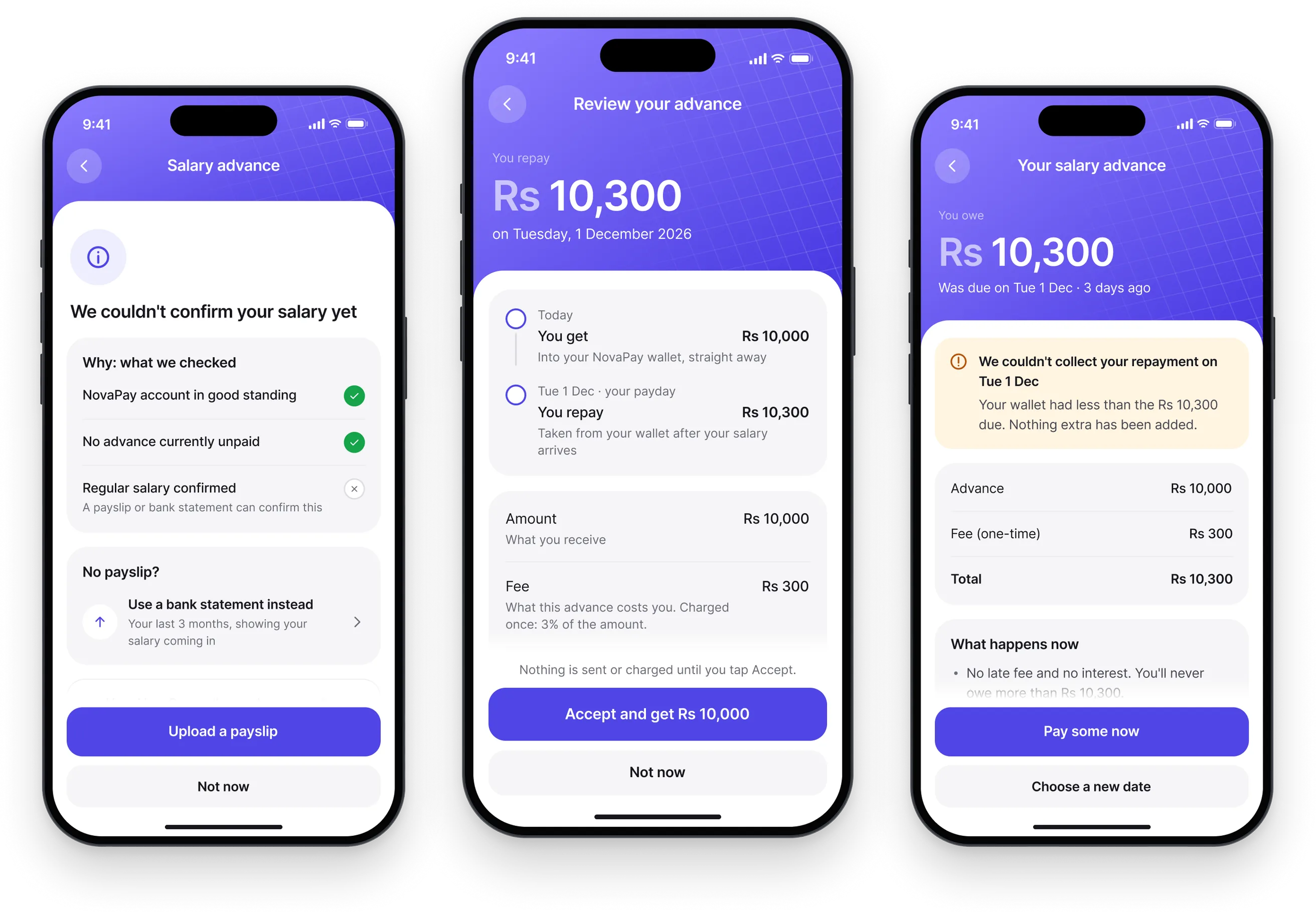
Three NovaPay screens: a decline with a clear next step, the terms with the cost and date beside Accept, and the options after a late payment
My role
Product Designer
Scope
Product UX, UI Design, UX Audit, Design Decisions
Tools
Figma, Claude, Claude Code

Building trust in a market where people are already cautious

Illegal loan apps have made many people wary of borrowing money through digital platforms. Hidden charges, aggressive reminders, and harassment have damaged people’s trust in these services.

NovaPay needed to communicate something different through its product experience.

The challenge was to make every interaction clear, fair, and predictable, especially when users were dealing with money.

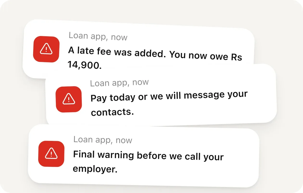
Threatening loan app notifications: a late fee was added, pay today or we will message your contacts, final warning before we call your employer

Four principles guided the redesign

Show only what people can actually borrow

Never display an amount that the product cannot offer.

Be clear about the cost

Show the total repayment amount and due date before asking users to accept.

Never increase someone’s debt

No additional interest or late payment fees.

Always explain what happens next

Whether someone gets approved, declined, or misses a payment, they should know why and what they can do next.

AI helped me move faster. I made the product decisions.

Planning

I broke down the product requirements, defined the scope, and established the rules AI needed to follow.

UX Audit

I used AI to review the existing interface, identify usability and accessibility issues, and prioritize improvements.

Design and Build

I selected the most important user flows and used AI to help build and refine the screens.

Research

I benchmarked products like Afterpay, KOHO, and Cleo to understand how other financial products handle borrowing, repayment, and user trust.

Testing and Iteration

I reviewed the running application, checked screenshots, and gave AI specific feedback to improve each iteration.

Deployment

I reviewed the final implementation, made the necessary changes, and tested the deployed experience.

Removing confusing and potentially misleading interactions

Before redesigning individual screens, I identified two problems that shouldn’t exist in the first place.

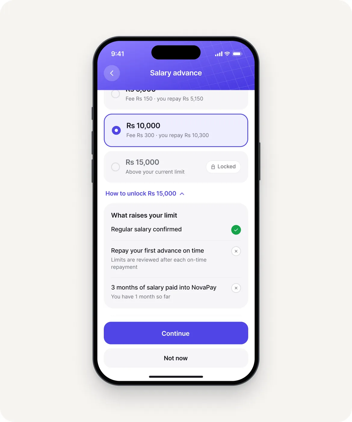
Choosing an amount, with Rs 15,000 locked above the current limit and a link explaining how to unlock it

Showing amounts users cannot borrow

Previously, users could encounter amounts beyond their borrowing limit.

This creates an expectation the product cannot meet.

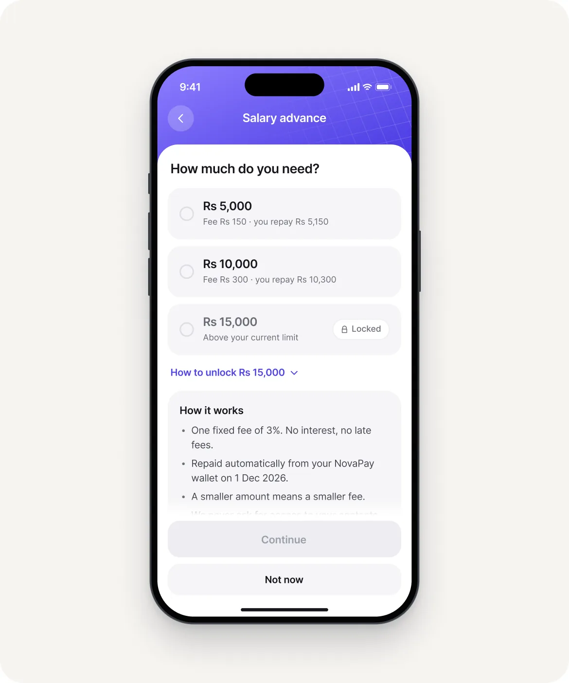
I changed this so users only see amounts they’re eligible to receive. Higher amounts remain locked, with a clear explanation of how to become eligible.

How much do you need, showing only the amounts the app can give, each with its fee

Changing the amount after approval

Imagine requesting Rs 15,000, only to be told after completing the checks that you can receive Rs 10,000.

That’s a frustrating experience.

I moved the eligibility checks before the offer is displayed. Once an amount is offered, it stays available for 24 hours.

The goal: What users see is what they can actually receive.

A design decision that took three iterations

Why I removed the problem instead of improving the screen

One of the most interesting parts of this project was figuring out how to handle situations where the approved amount was lower than what someone requested.

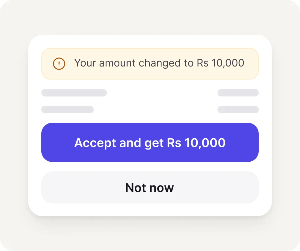
Your amount changed to Rs 10,000, with Accept and get Rs 10,000 already filled in

What AI suggested

A notification explaining the change, with the new amount already selected

I didn’t think that was fair to the user.
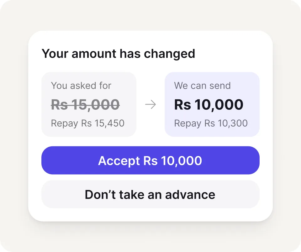
Your amount has changed: you asked for Rs 15,000, we can send Rs 10,000, with Accept Rs 10,000 and Don’t take an advance

First attempt

Explain the change

The new amount was shown alongside the original request, with an option to decline the advance.
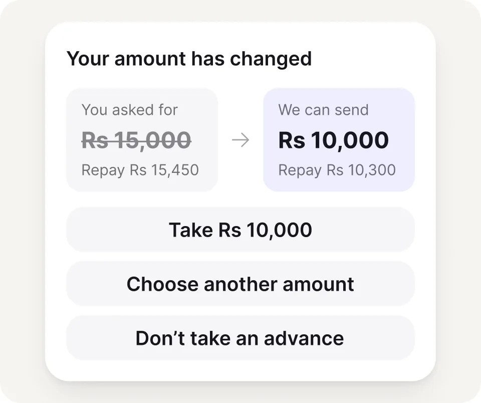
Your amount has changed, with three equal choices: take Rs 10,000, choose another amount or don’t take an advance

Second attempt

Give users more control

I explored clearer amount comparisons and equal choices, including the option to walk away.
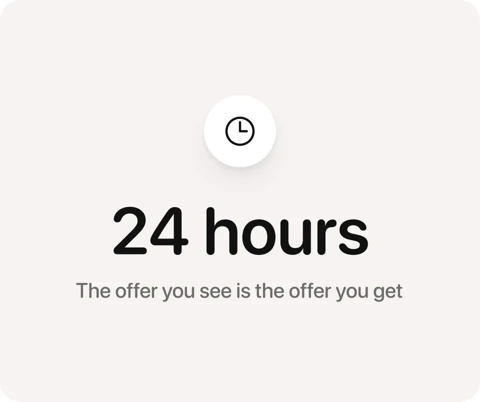
24 hours: the offer you see is the offer you get

Final decision

Remove the situation entirely

Instead of designing a better way to communicate a reduced offer, I moved the eligibility checks earlier in the journey.

Now, users only see amounts NovaPay can actually provide. The offer remains valid for 24 hours.
This was a good reminder that sometimes the best UX solution isn’t another screen. It’s removing the need for that screen altogether.

Design decision 01

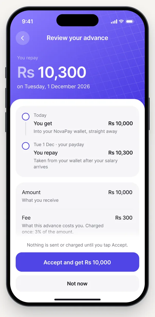
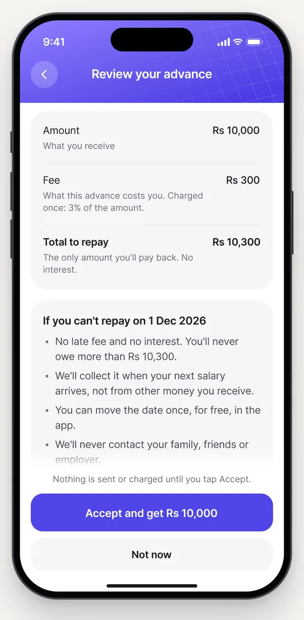
Making loan terms easy to understand

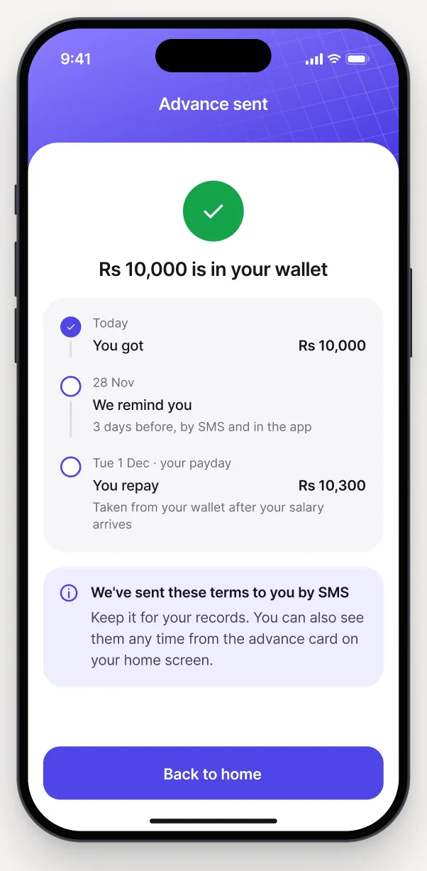
I also made sure the terms were sent through SMS after the advance was approved, so users could refer back to them later.

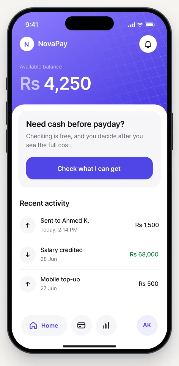
  • The NovaPay home screen with a card offering to check what you can getChecking is free
  • Review your advance: you repay Rs 10,300 on 1 December, with the timeline and costs above AcceptCost, date and Accept together
  • The terms screen scrolled to what happens if you can’t repay on timeWhat happens if you can’t repay
  • Advance sent: Rs 10,000 is in your wallet, with the terms also sent by SMSTerms also sent by SMS

The goal: Help people understand the agreement before they commit.

Design decision 02

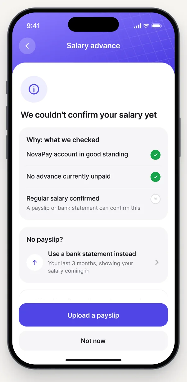
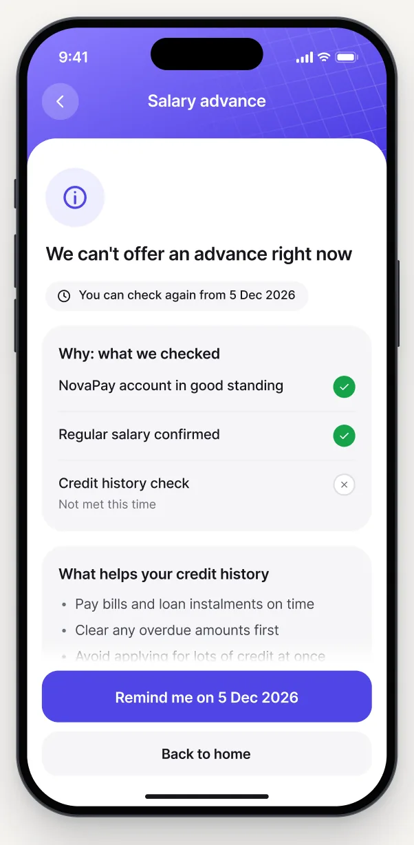
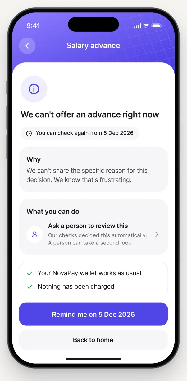
Making declined applications more helpful

I also moved away from aggressive red error screens. A declined application isn’t necessarily a user’s mistake, so the visual language should remain neutral and respectful.

  • A decline because the salary couldn’t be confirmed, with a checklist and an option to upload a payslipIncome not confirmed yet
  • A decline because of credit history, with what helps and a reminder for when to check againCredit history
  • A decline with a reason that can’t be shared, offering a person to review itA reason we can’t share

The goal: Give people an explanation and a reasonable next step.

Design decision 03

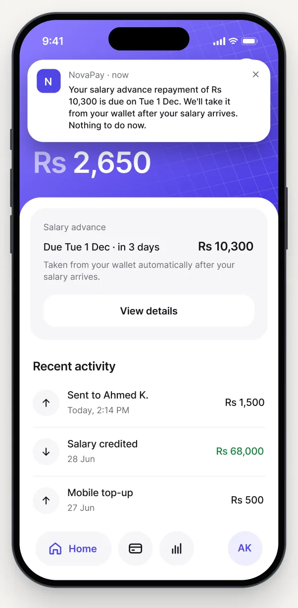
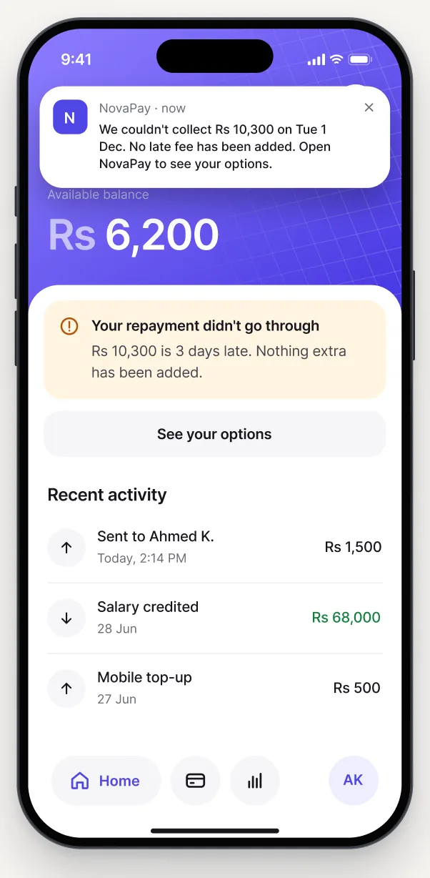
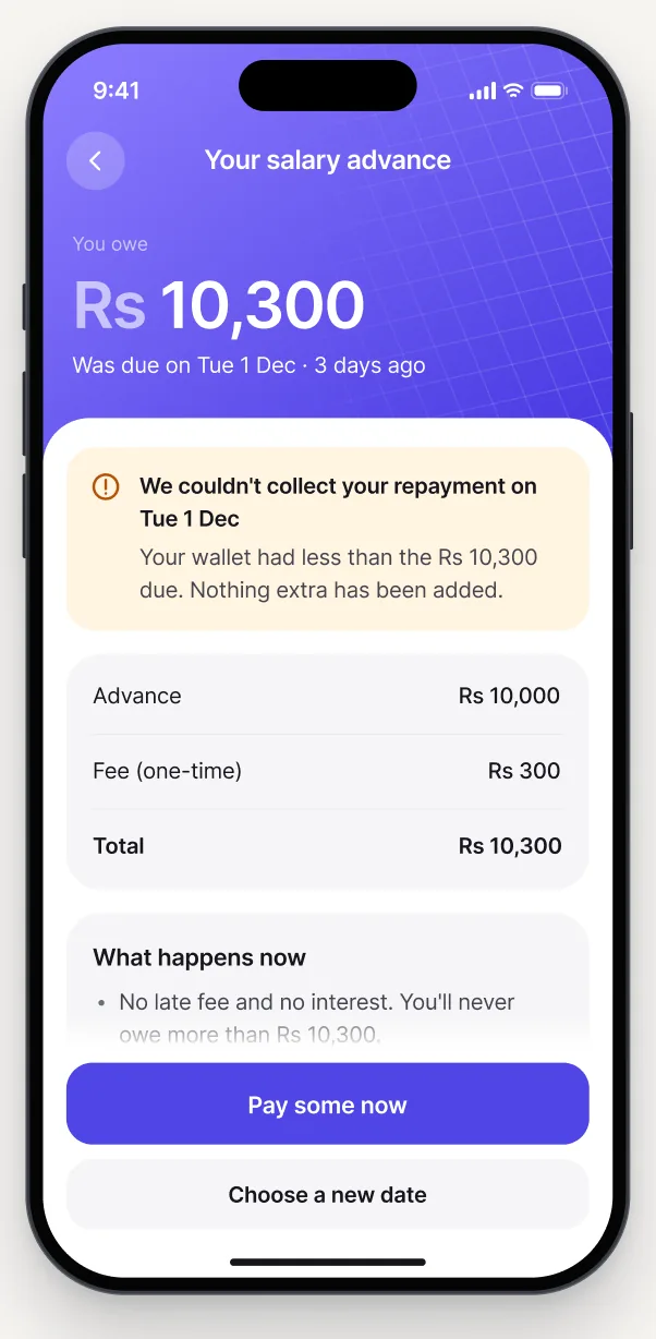
Making missed payments easier to manage

The experience also explains what happens if the payment remains unpaid, before any further consequences apply.

  • A calm reminder that the repayment is due in 3 daysDue in 3 days
  • The home screen after a missed repayment, shown in amber with no extra feesPayment didn’t go through
  • Your salary advance: what you owe, what happens now and your optionsYour options, no fees added
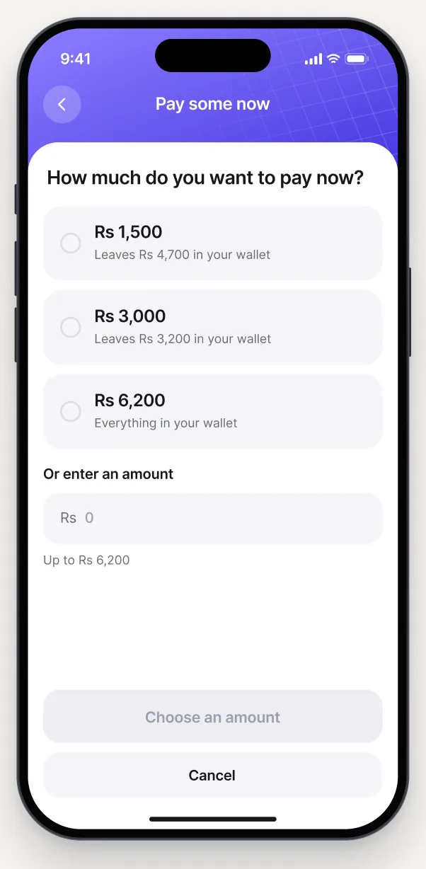
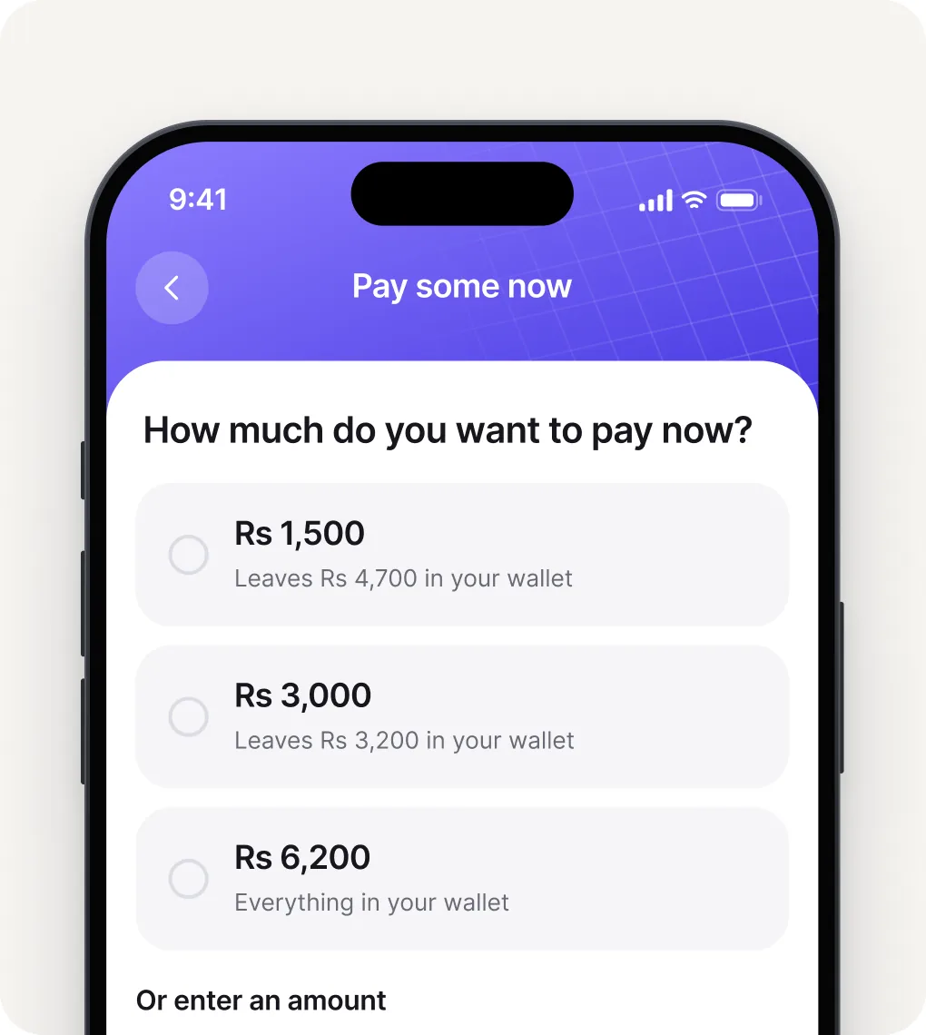
  • Pay some now, where each amount shows what it leaves in your walletPay some now
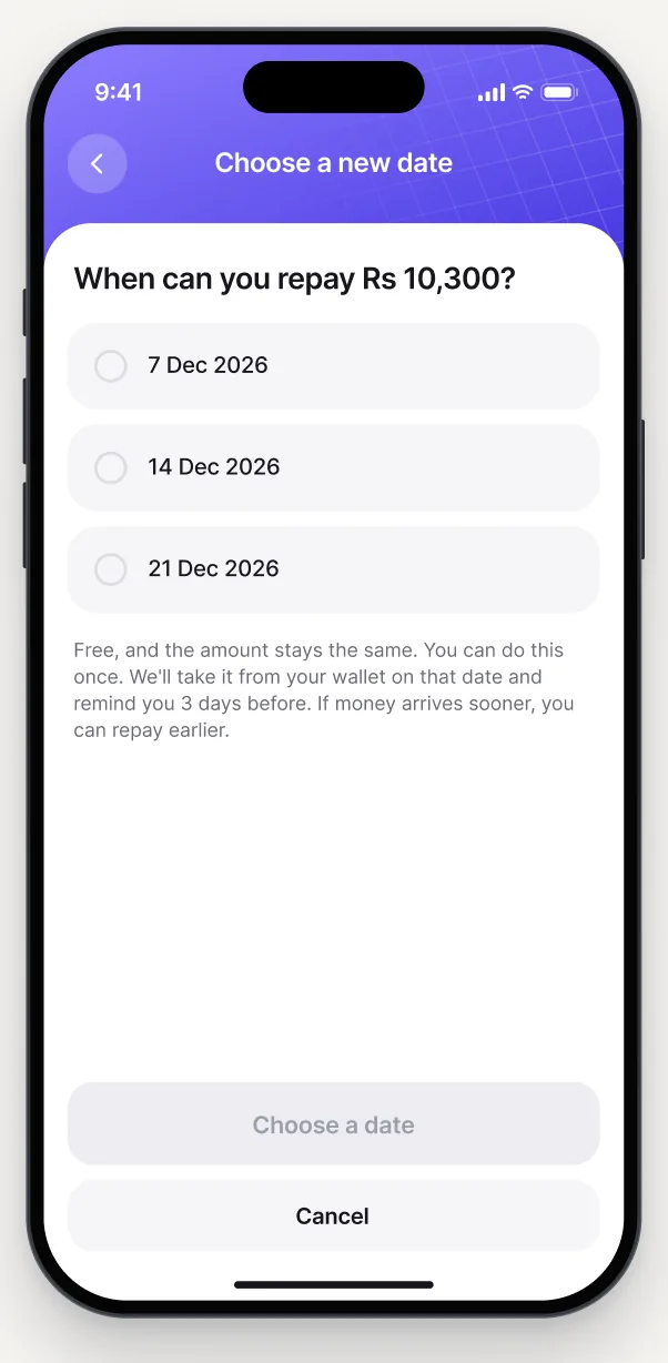
  • Choose a new date to repay, once and for freeMove the date once, free
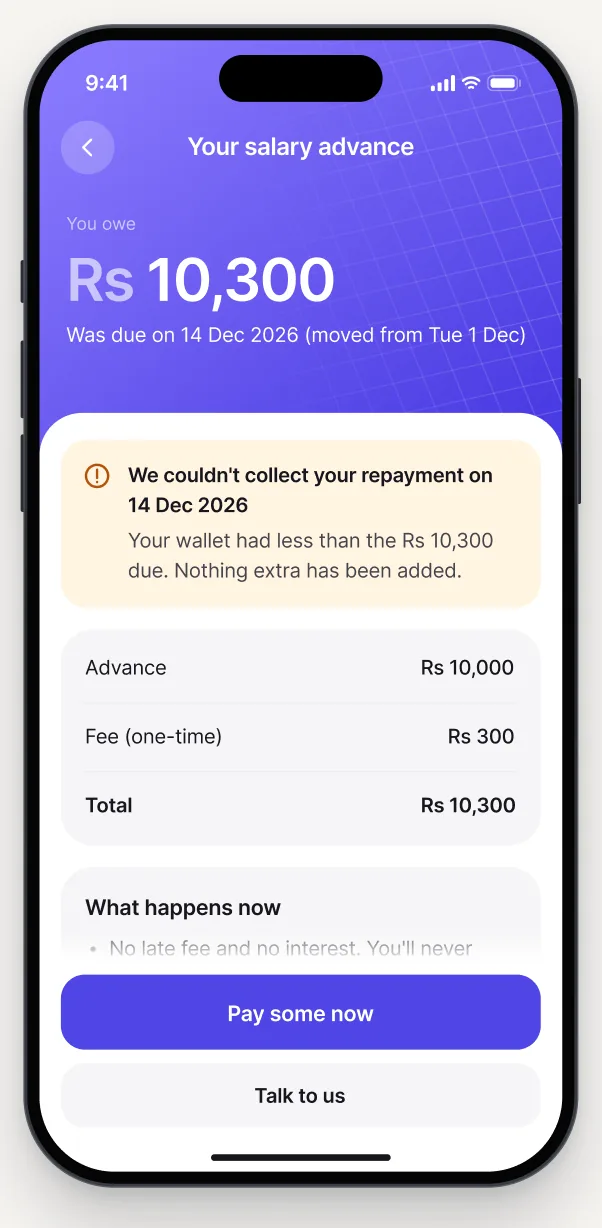
  • A second missed date, where Talk to us replaces the date changeMissed again: talk to us
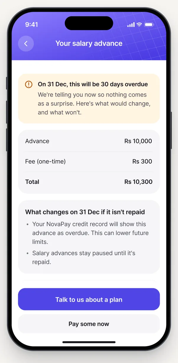
  • A heads up before day 30 explaining what would change and what won’tHeads up before day 30

The goal: Give users more control when they’re already dealing with a difficult situation.

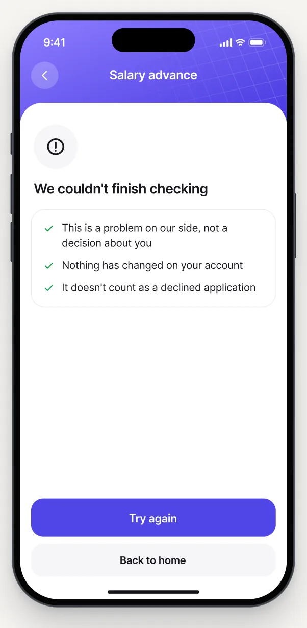
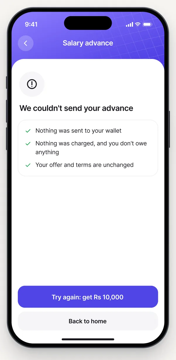
A technical problem shouldn’t look like a rejected application

This distinction helps prevent unnecessary confusion and anxiety.

  • We couldn’t finish checking: a problem on our side, not a decision about youThe check didn’t finish
  • We couldn’t send your advance: nothing was sent and nothing was chargedThe money wasn’t sent

What I would measure after launch

Understanding

Can users correctly identify how much they need to repay and when?

Freedom of choice

Do users feel comfortable declining an offer rather than feeling pushed to accept?

Repayment

Are more users repaying on time, with fewer accounts reaching default?

Trust

Are complaints about unexpected charges and unclear repayment terms decreasing?

Helpful alternatives

Do people who choose partial payments or a new repayment date eventually repay in full?

These would be the key signals I’d use to evaluate the redesigned experience after launch.

Assumptions I would love to clear next

Some of the product rules used in this concept, including the 24-hour offer validity and free repayment date change, would need confirmation from the relevant teams before launch.

I’d validate the following areas:

Legal and Compliance

Confirm the applicable lending regulations, disclosure requirements, and debt collection policies.

Risk and Engineering

Check whether eligibility checks can happen before an offer is displayed and whether the proposed repayment rules are technically feasible.

Customer Support

Understand common borrower complaints and confirm the team can support manual reviews and repayment requests.

Data and Research

Validate the most common decline reasons, borrowing patterns, and the language users understand best.

Borrowers

Test the experience with real users, including how they understand the terms and what makes them feel comfortable borrowing.

Key takeaway

Good financial UX is about giving people control.

The Pay some now screen, where each amount shows what it leaves in your wallet

Words from people I’ve worked with.

  • Molly Final, Head of Design, Mycah

    Molly Final

    Head of Design, Mycah

    He was extremely pro-active, self-led, and came up with many ideas to enhance my vision. A joy to work with on this!

  • Brandon Bevans, CEO, Prime

    Brandon Bevans

    CEO, Prime

    It doesn’t feel like “just a job” when working with him, he takes personal interest in the project, cares about the outcome.

  • John Heretakis, CEO, AutoQuoto

    John Heretakis

    CEO, AutoQuoto

    Zuraiz is one of the best designers I’ve worked with. He’s very versatile and has the ability to work across many domains and needs.

  • Sam Hollander, CEO, Autopilot

    Sam Hollander

    CEO, Autopilot

    Great experience working with Zuraiz! He delivered the content on time and greatly exceeded my expectations.

  • Vivek Kukkapali, CEO, Know Your Skin

    Vivek Kukkapali

    CEO, Know Your Skin

    He was professional, communicated clearly, and delivered a modern, user-friendly design that exceeded expectations.

  • Michael Faulds, CMO, Liquid Sunset

    Michael Faulds

    CMO, Liquid Sunset

    He not only possesses an exceptional eye for design but also has a deep understanding of user experience and functionality.

A green mountain ridge under a pale sky

Let’s build something
great together.

I'm currently available for new projects. Connect with me on LinkedIn or download my resume to learn more about my experience.